INDITEX SGA
Automating warehouses with style — Brand universe creation for Inditex SGA team (spanish for Warehouse Management System). Conceptual design, touchpoints update and differentiation within the company.
Client
Inditex
Year
2019/2020
Role
Lead Digital Designer
What I did
Discovery, branding and web design
The warehouses, a bottleneck in the business model of any retailer. Given their importance any effort towards optimization is necessary, and in a giant like Inditex it is the SGA team that is responsible for ensuring the smooth flow of daily operations. Such a vital team requires visibility, a brand and quality resources to communicate effectively and, why not, to differentiate themselves.
At its inception this project seemed destined to be just another venture executing digital products without a clear vision. However, it took an exciting turn when I proposed a ground-up redesign of the scant existing brand resources. Rooted in a concept inspired by the physical distribution of warehouses (areas, pallets, packages, etc.), I crafted a flexible and distinctive visual language that seamlessly integrates with the ethos of Inditex. This aesthetic is not only easy to apply to both existing and proposed touchpoints but also elevates the brand's presence and impact.
What started as a mere facelift evolved into a transformative project. Beyond implementing a new visual identity in warehouse management applications, blending functionality with visually captivating design, we defined the mission, values, attributes and resources that embody the brand. This holistic approach not only optimizes operational efficiency but also radiates modernization and professionalism throughout the department.
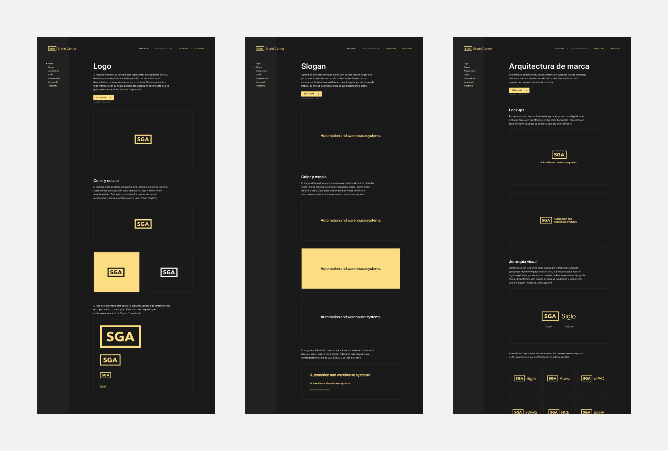
More than a visual overhaul, this project has become a beacon of inspiration for SGA, laying the groundwork for a future of cohesive and impactful visual communication. The culmination of guidelines, best practices, and resources now resides in an accessible Brand Center, serving as a compass for the entire team on their journey towards excellence.
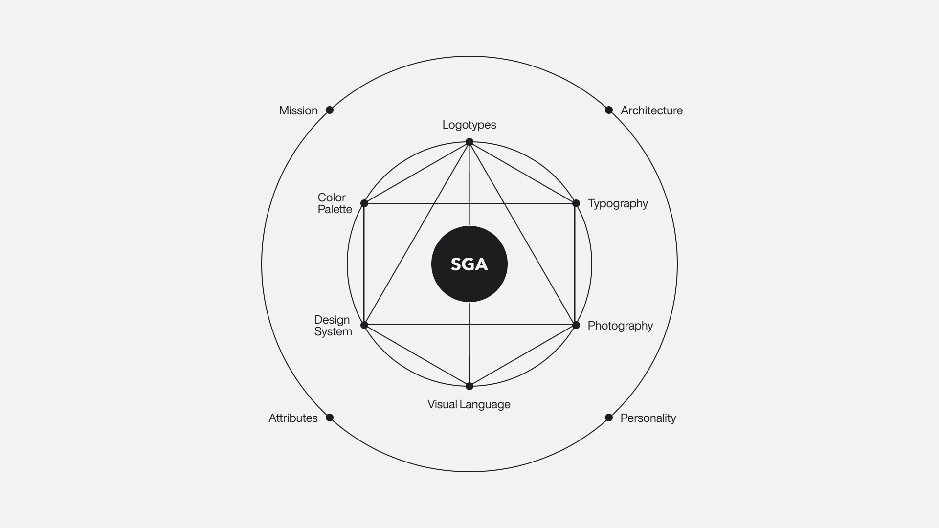


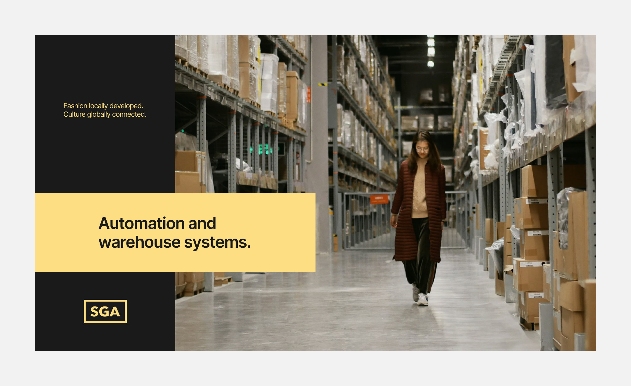
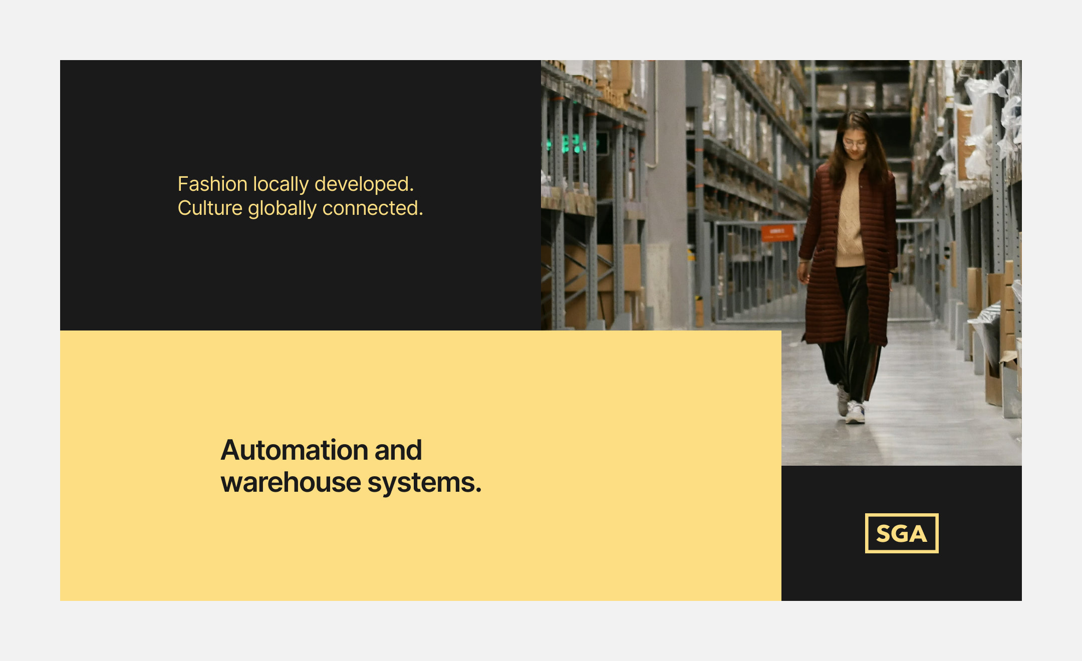
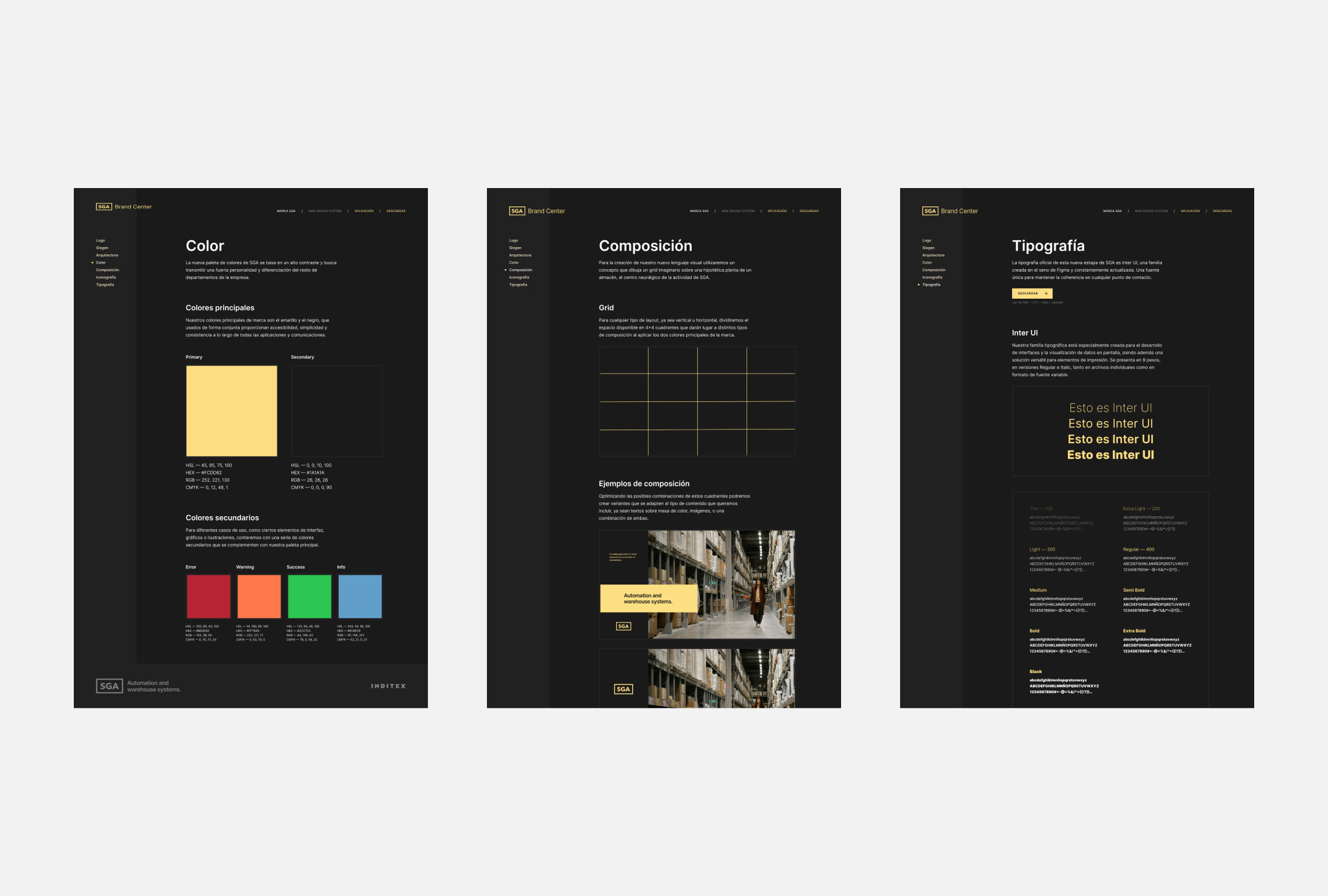
A new brand universe crafted from the very foundations of the warehouses, playing with the possibilities offered by their distribution, transformed into a grid upon which to design any touchpoint.
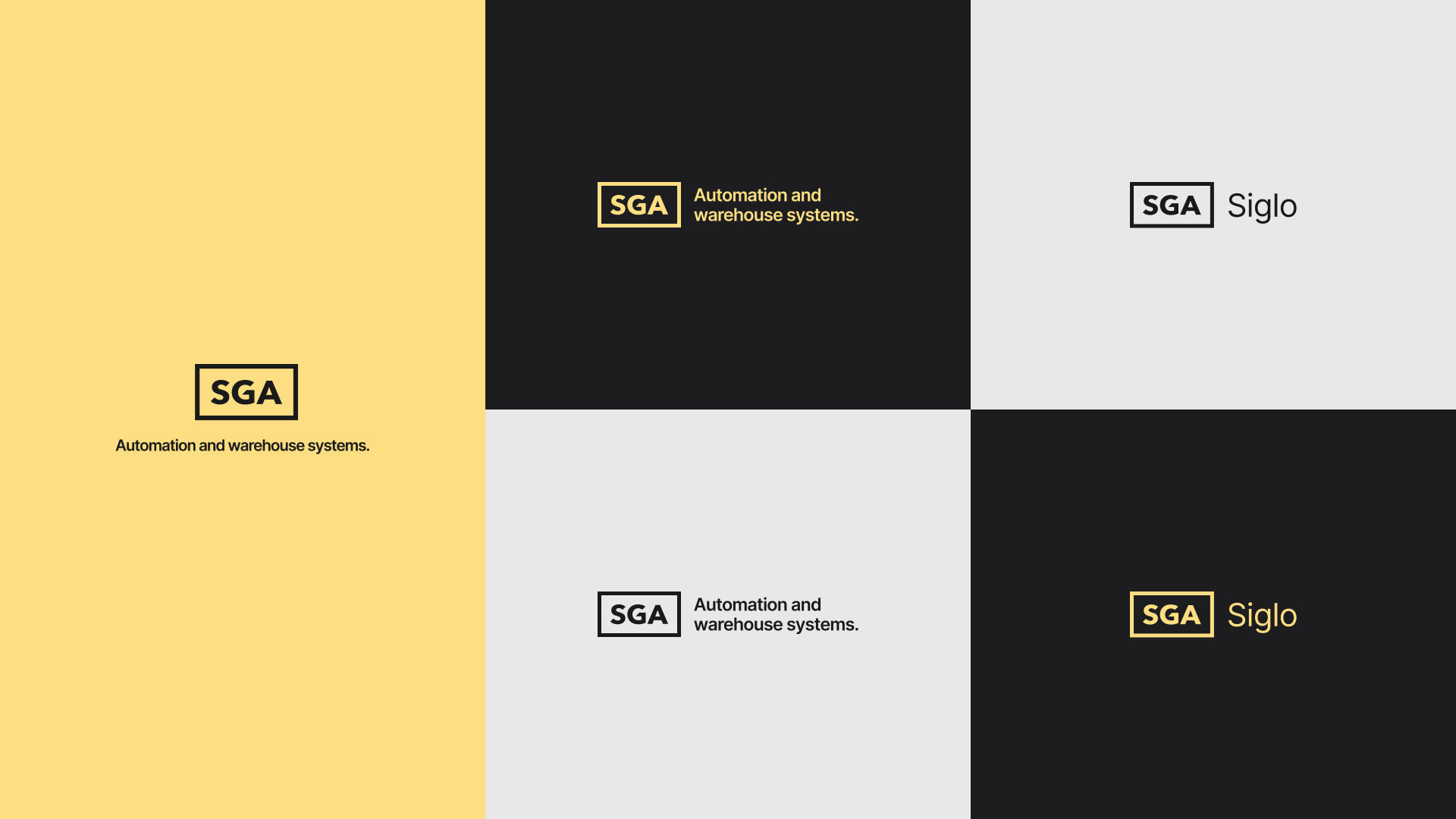
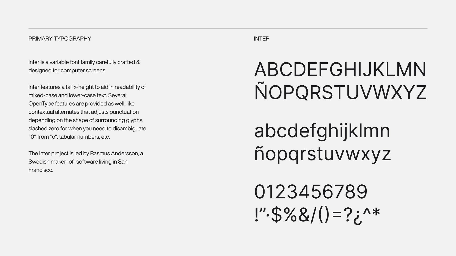
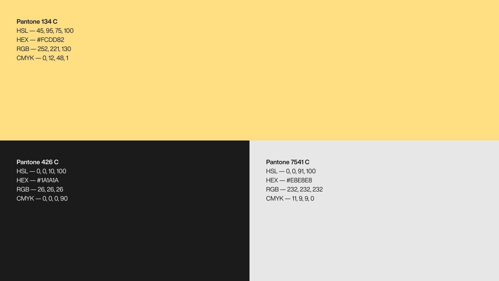
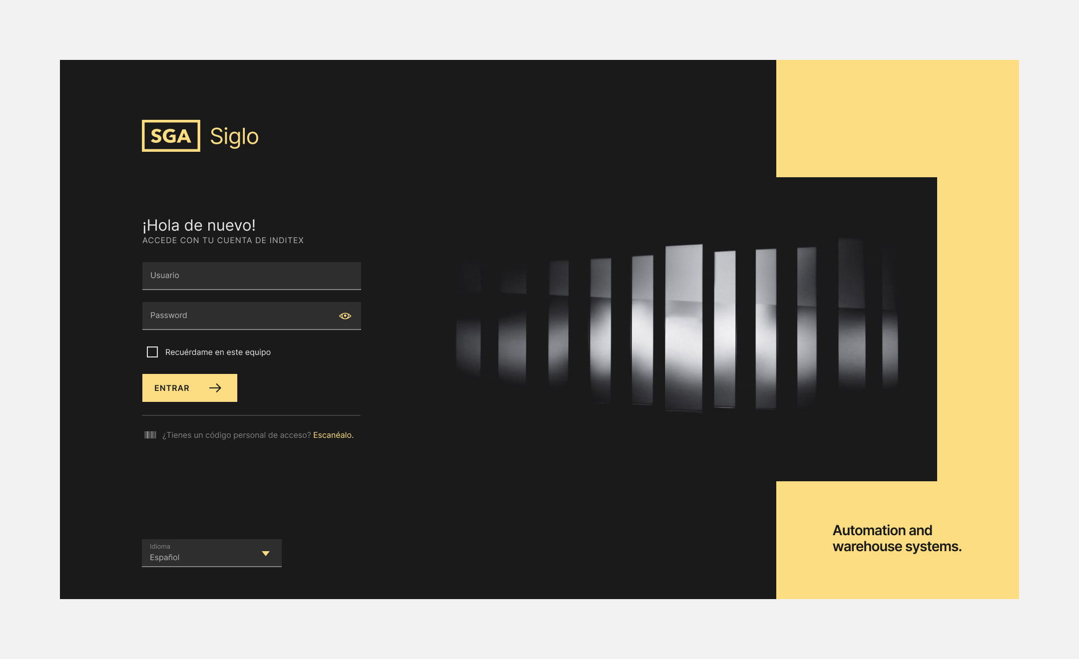
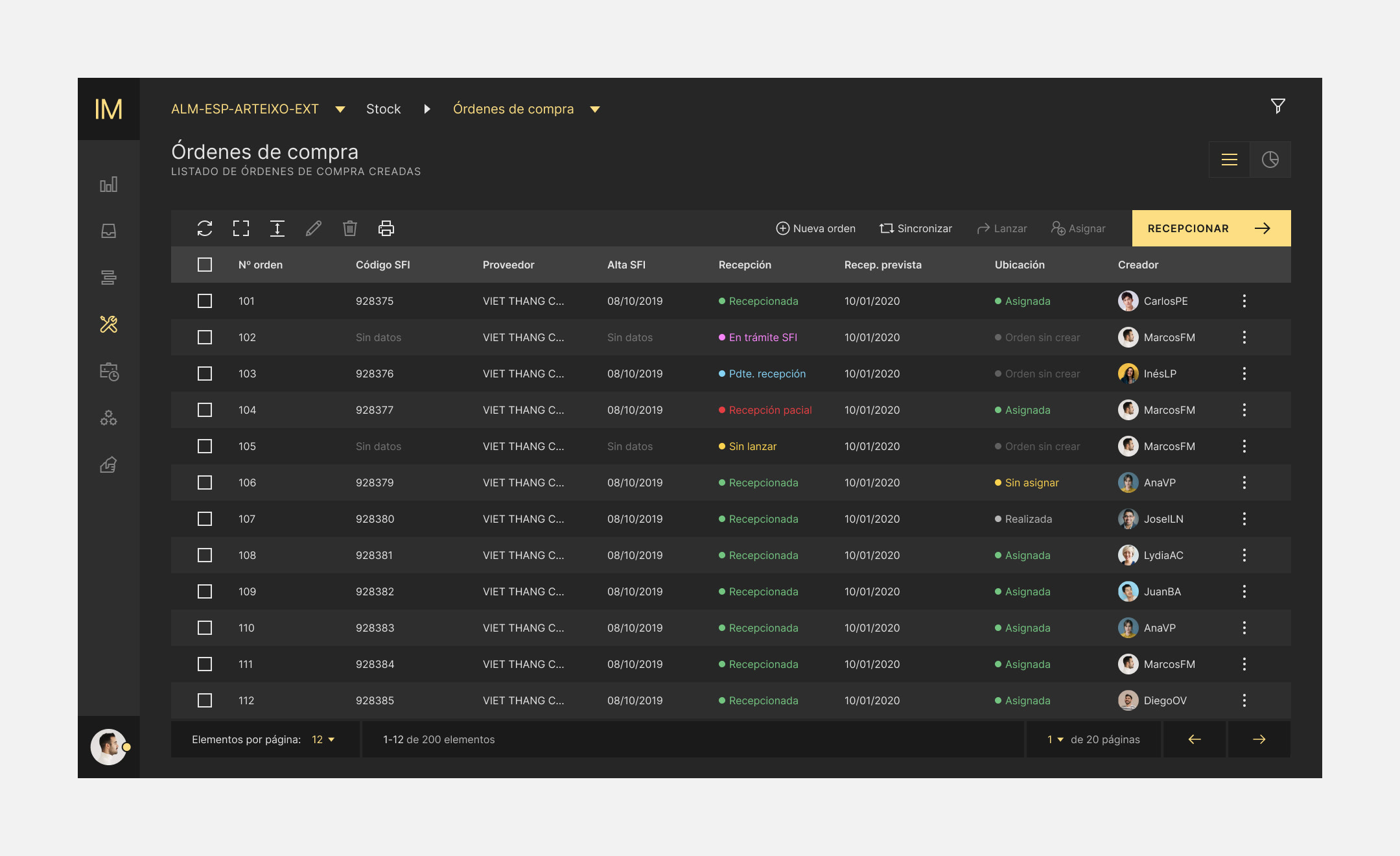
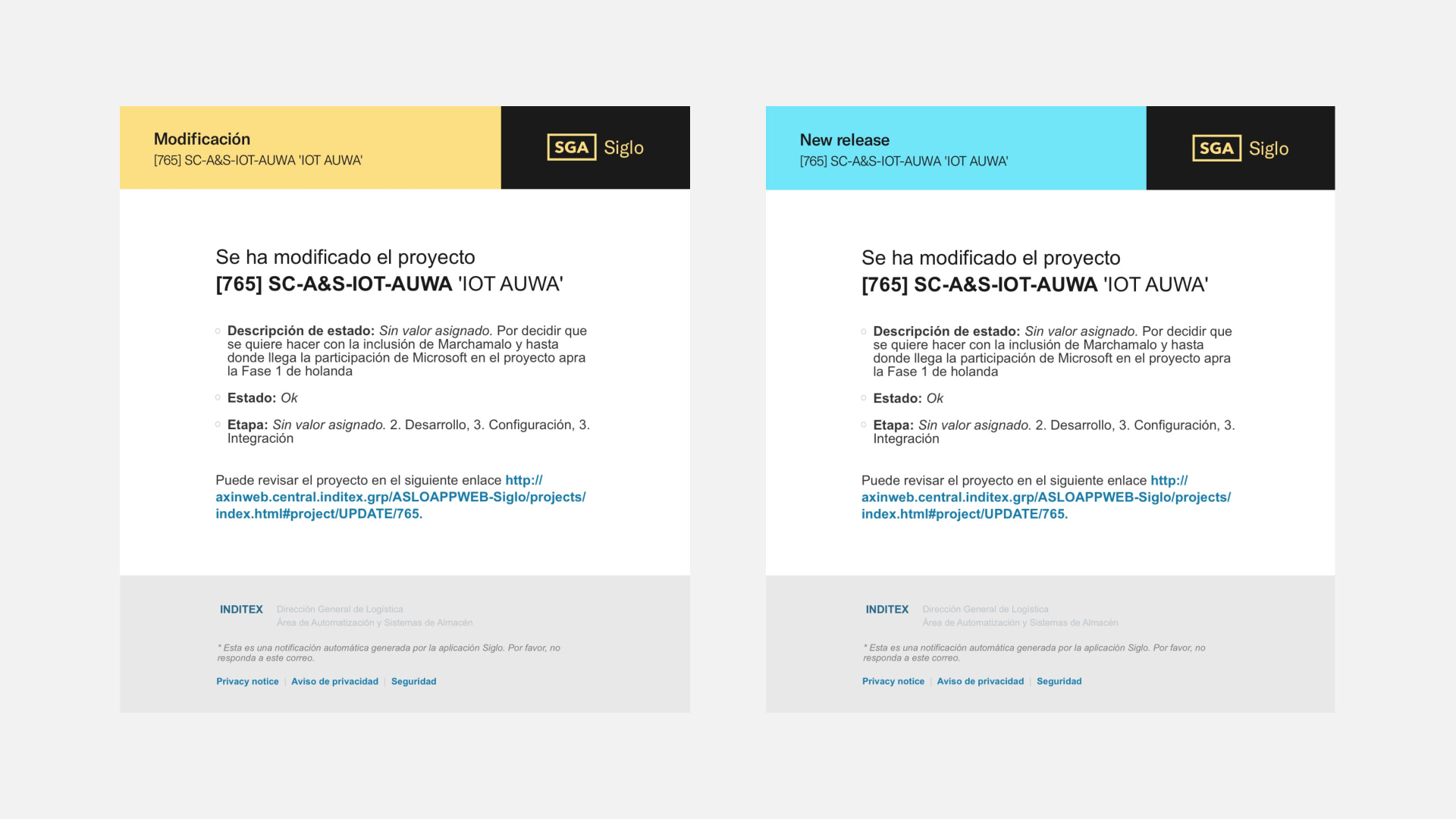
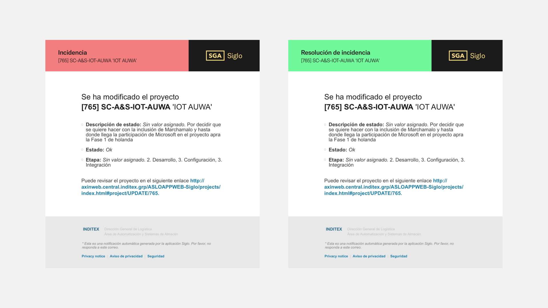
A flexible visual language applicable to any element, ranging from logos for team and applications to interfaces or notifications. All of this is grounded in a new typography and a contrasting, distinctive color palette.
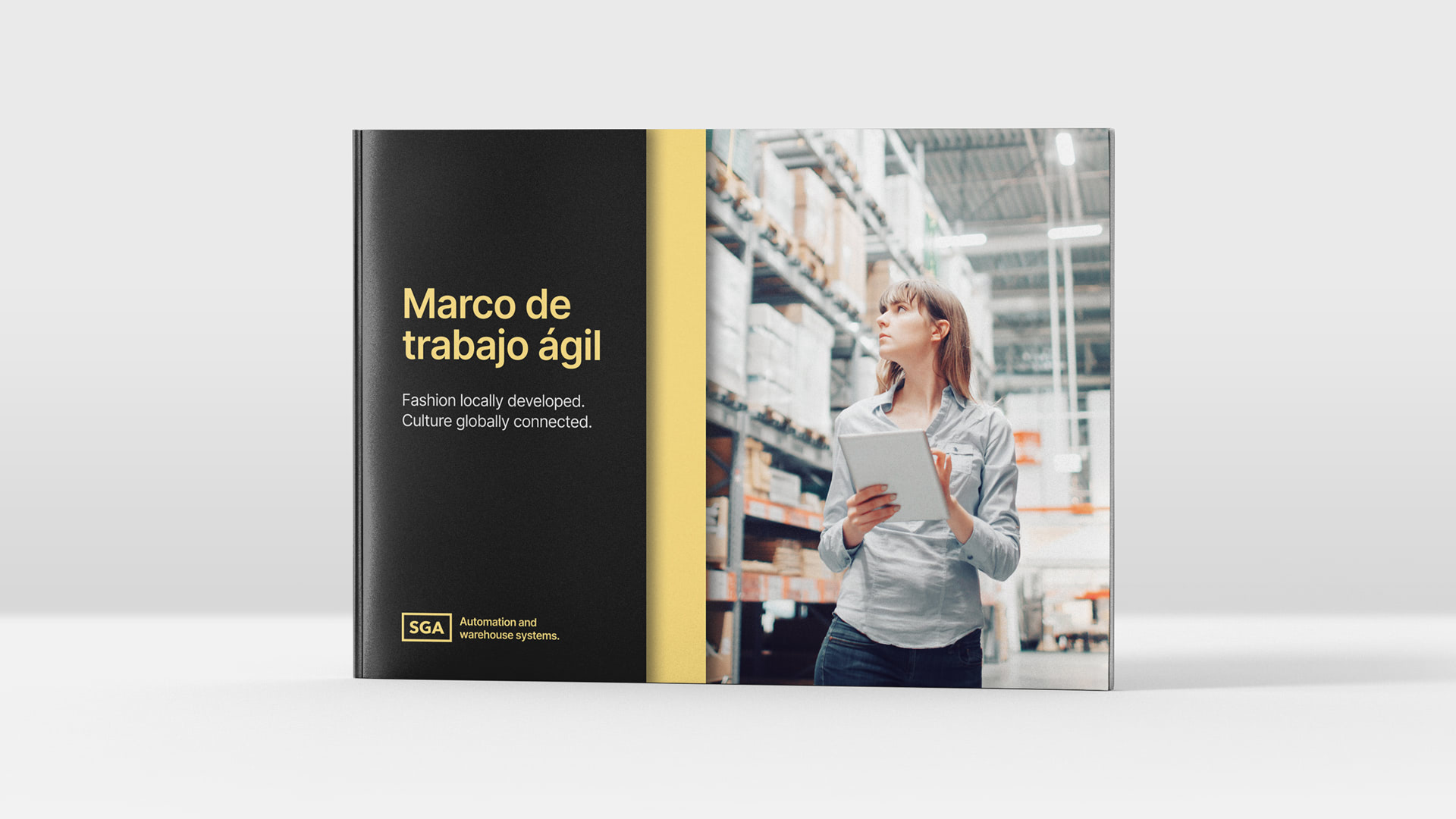
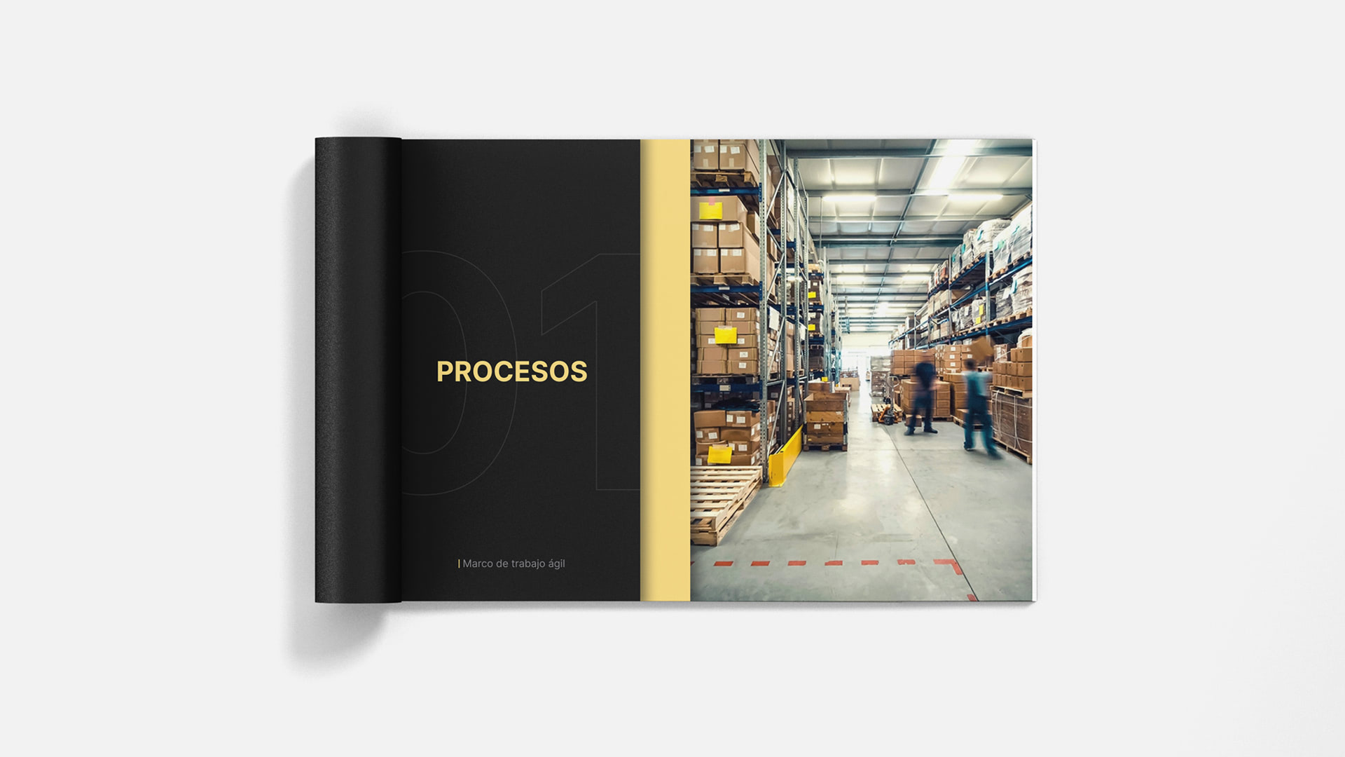
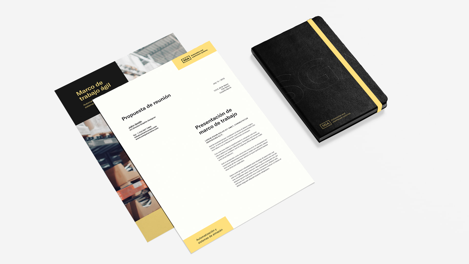


All existing applications receive a much-needed update: internal presentations, dossiers, stationery elements, or wallpapers.
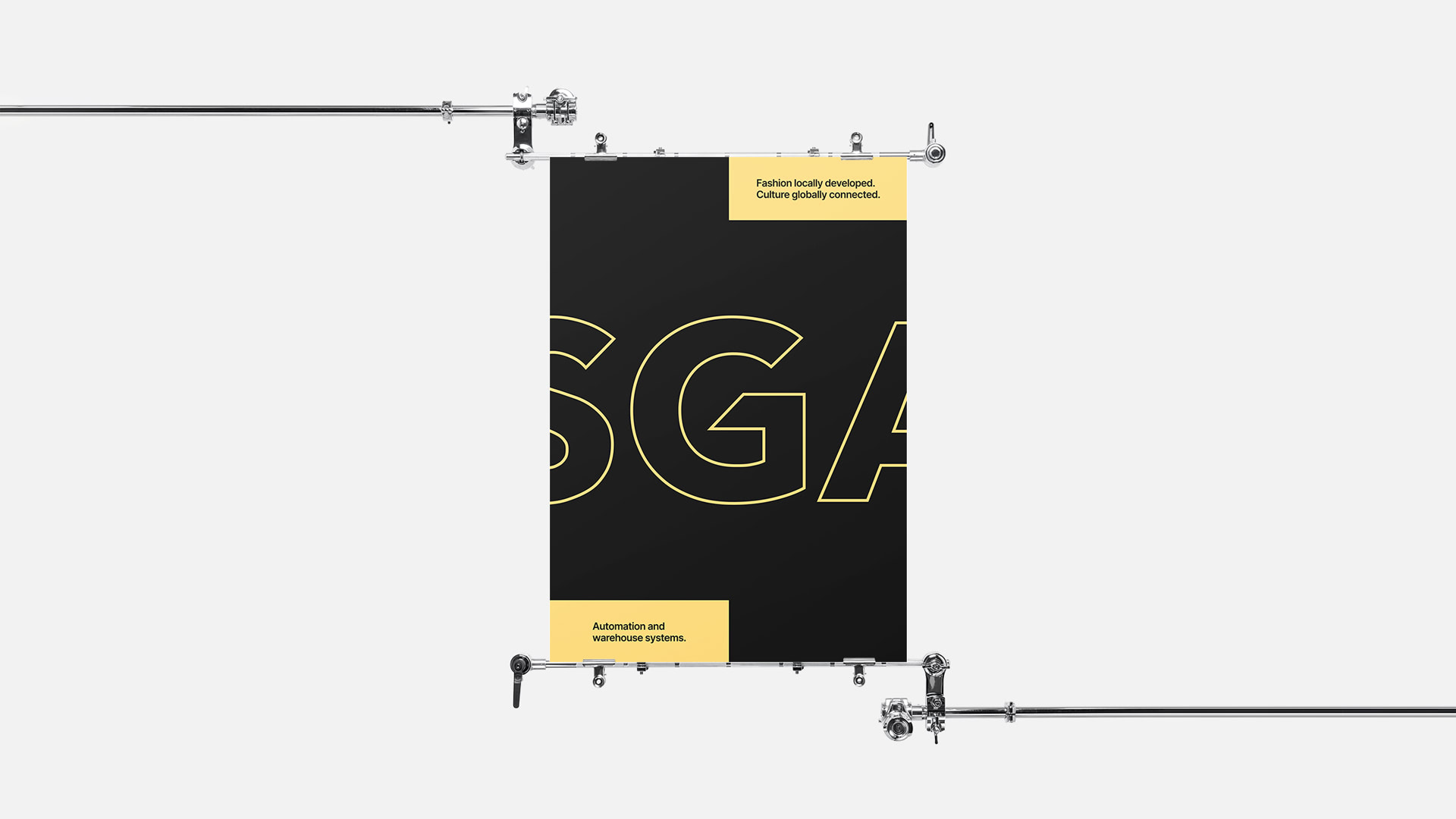
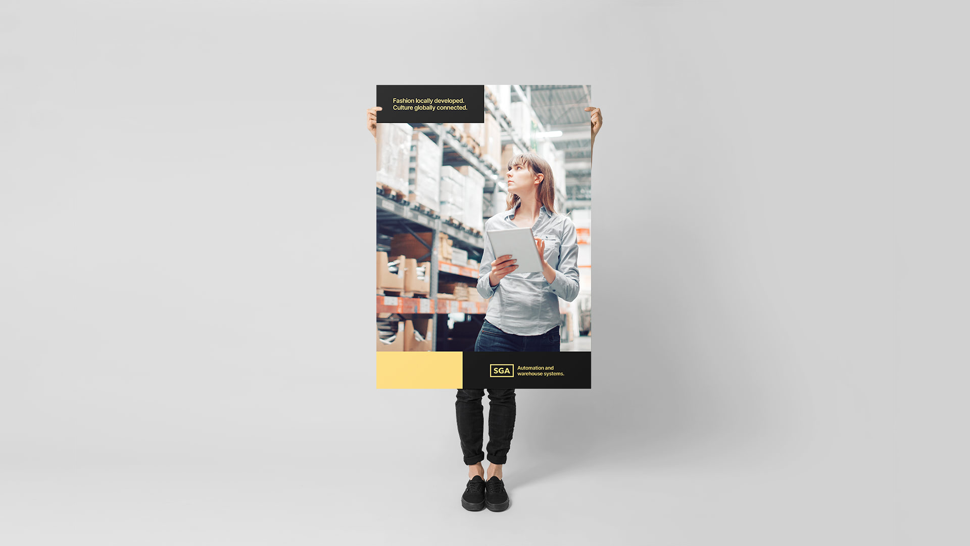
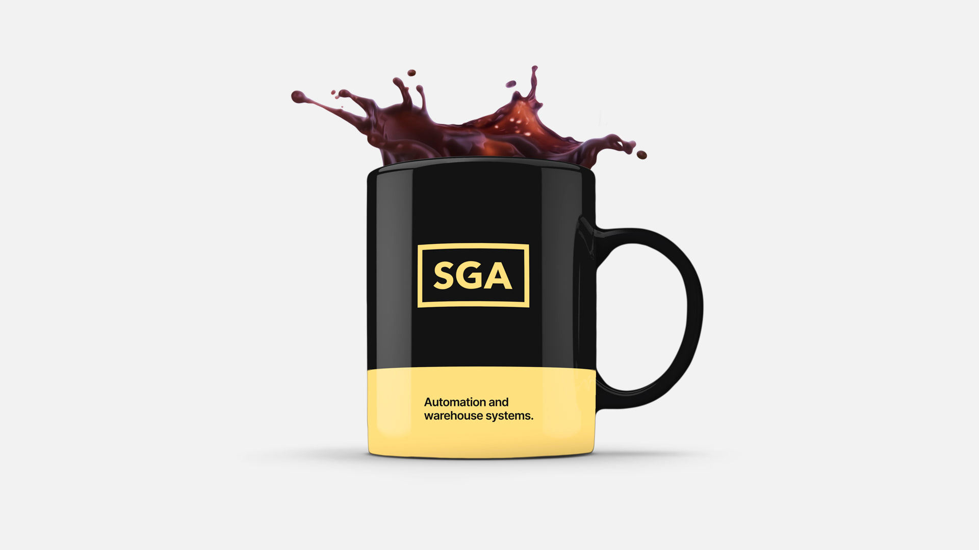

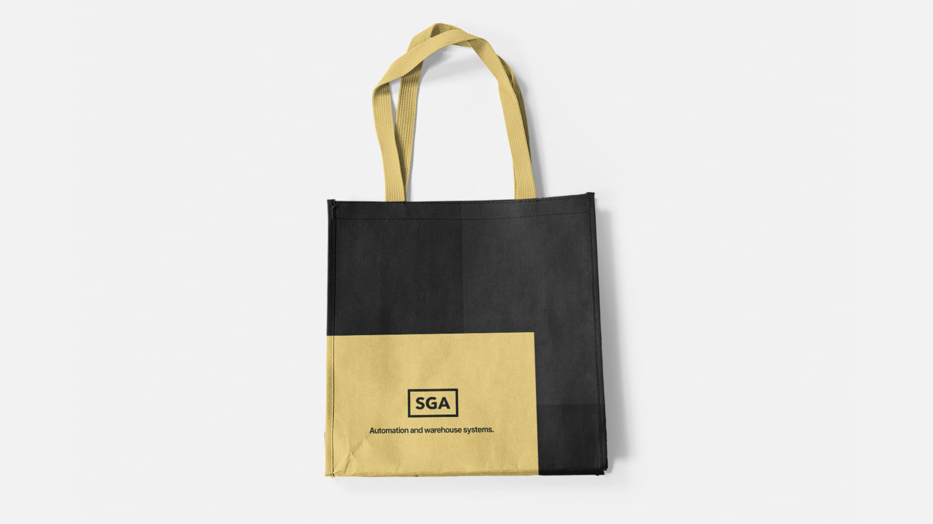




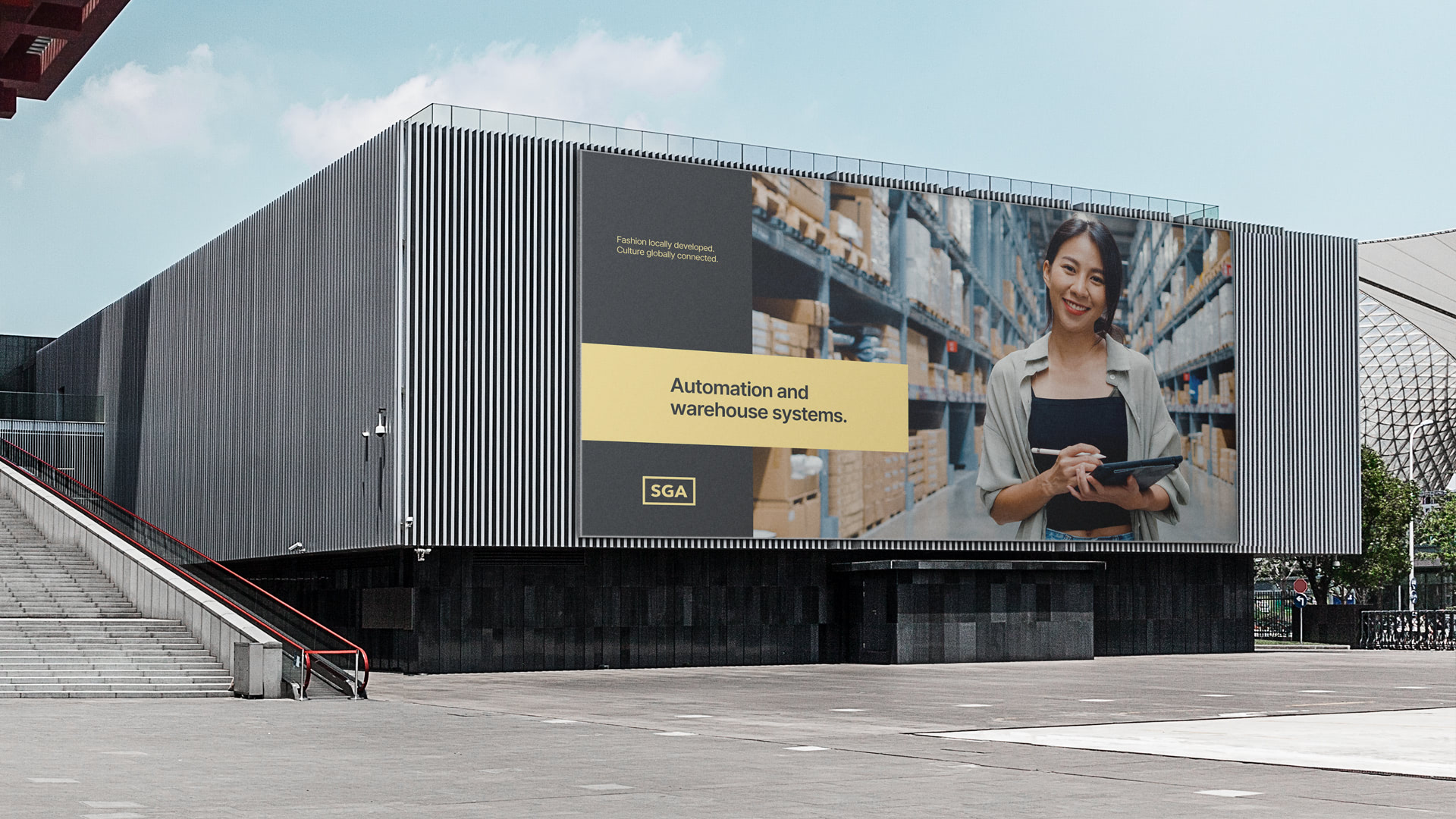
But we don't stop there. New elements come to life leveraging the potential of this new brand: office posters, totes, mugs, vynil car wraps and t-shirts are some of the additions to the visual imagery of this revamped SGA.
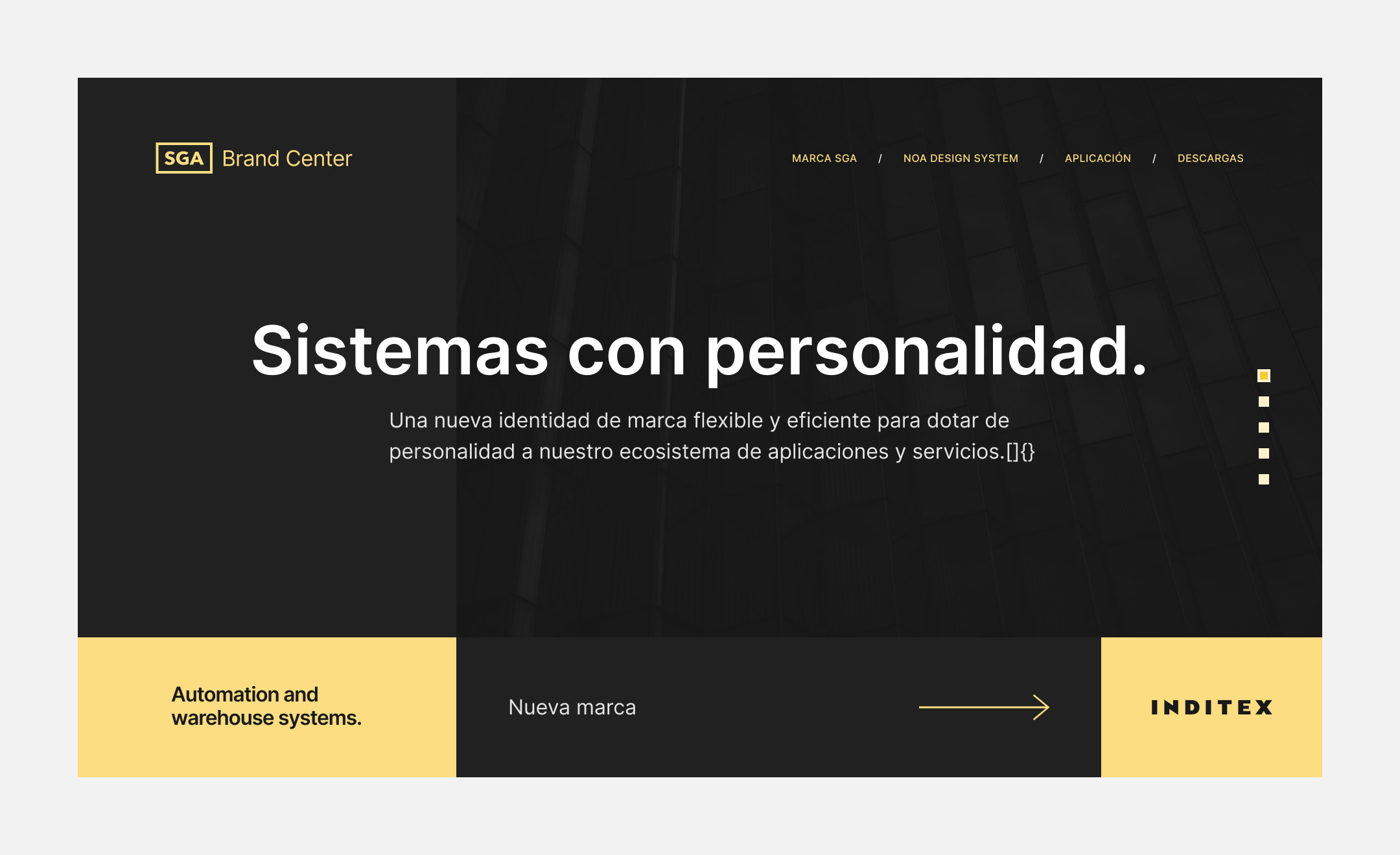
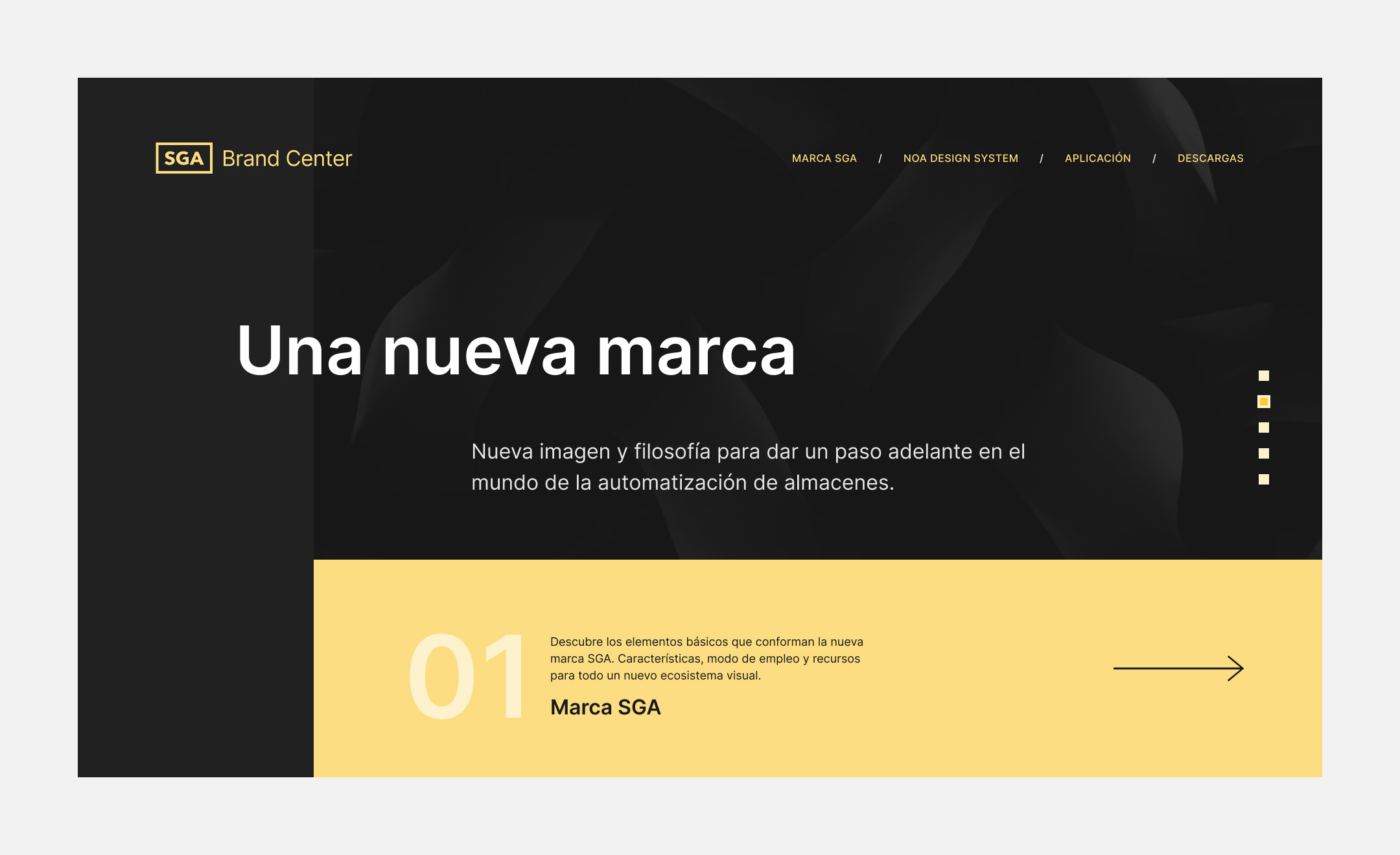
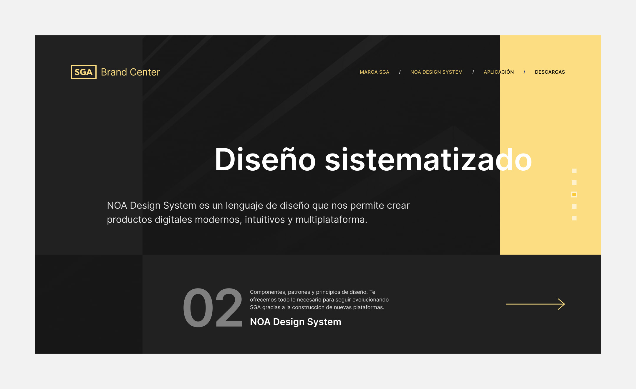
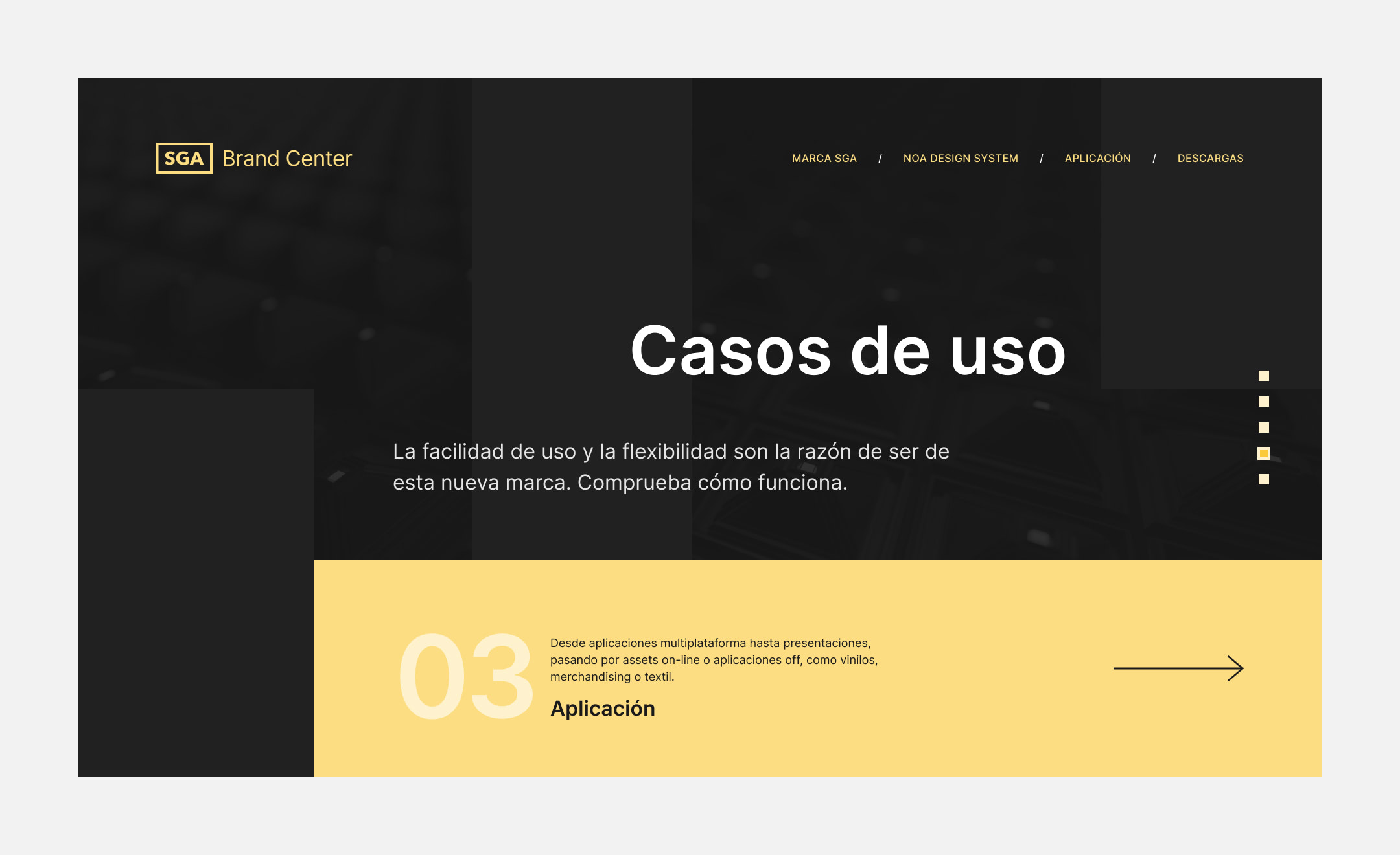
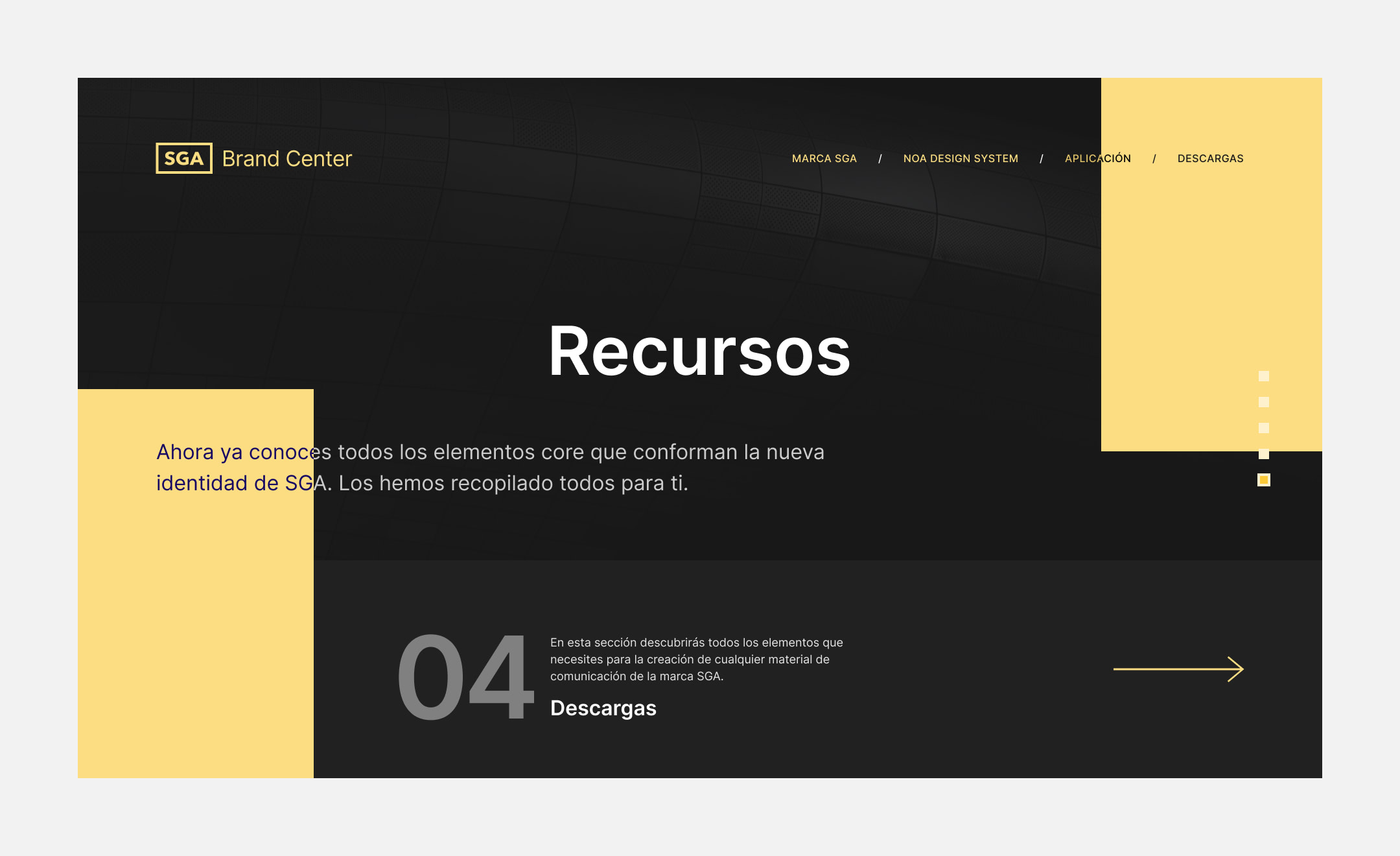
The cherry on top is a Brand Center developed from scratch, gathering usage guidelines, best practices, downloadable resources, and the inspiration that leads us to a distinctive brand with its own personality within the Inditex universe.
Do you like what you see?
Let's talk!
Check out these other projects

NextailCase study coming soon

ÁgataDigital potential comes full circle
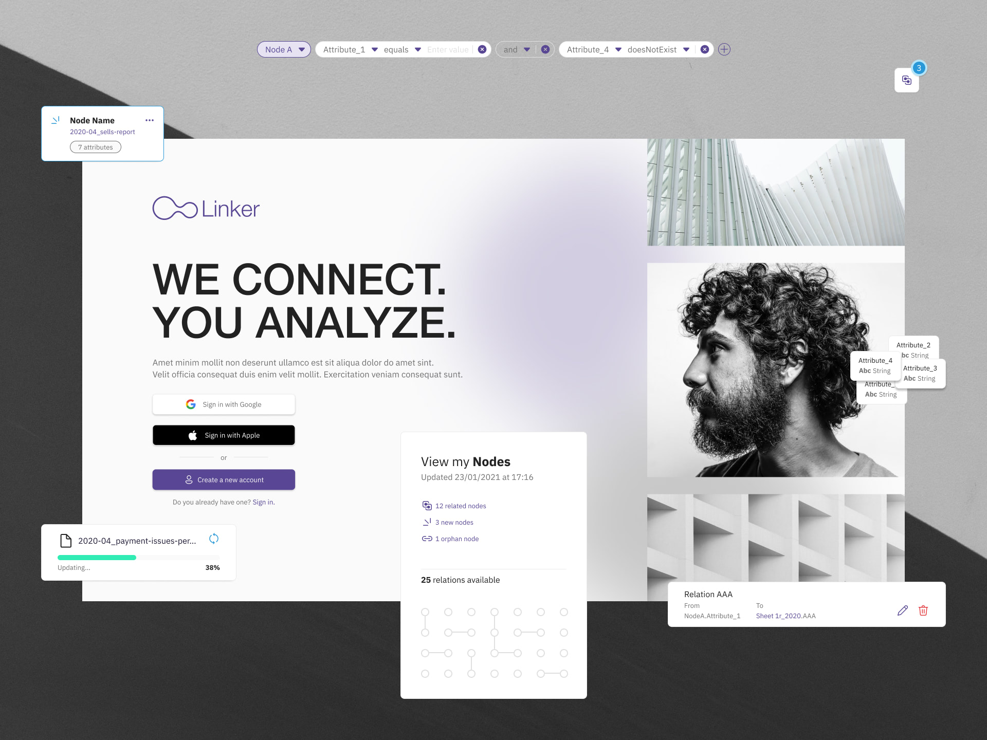
OctoHarmonizing data in a visual way
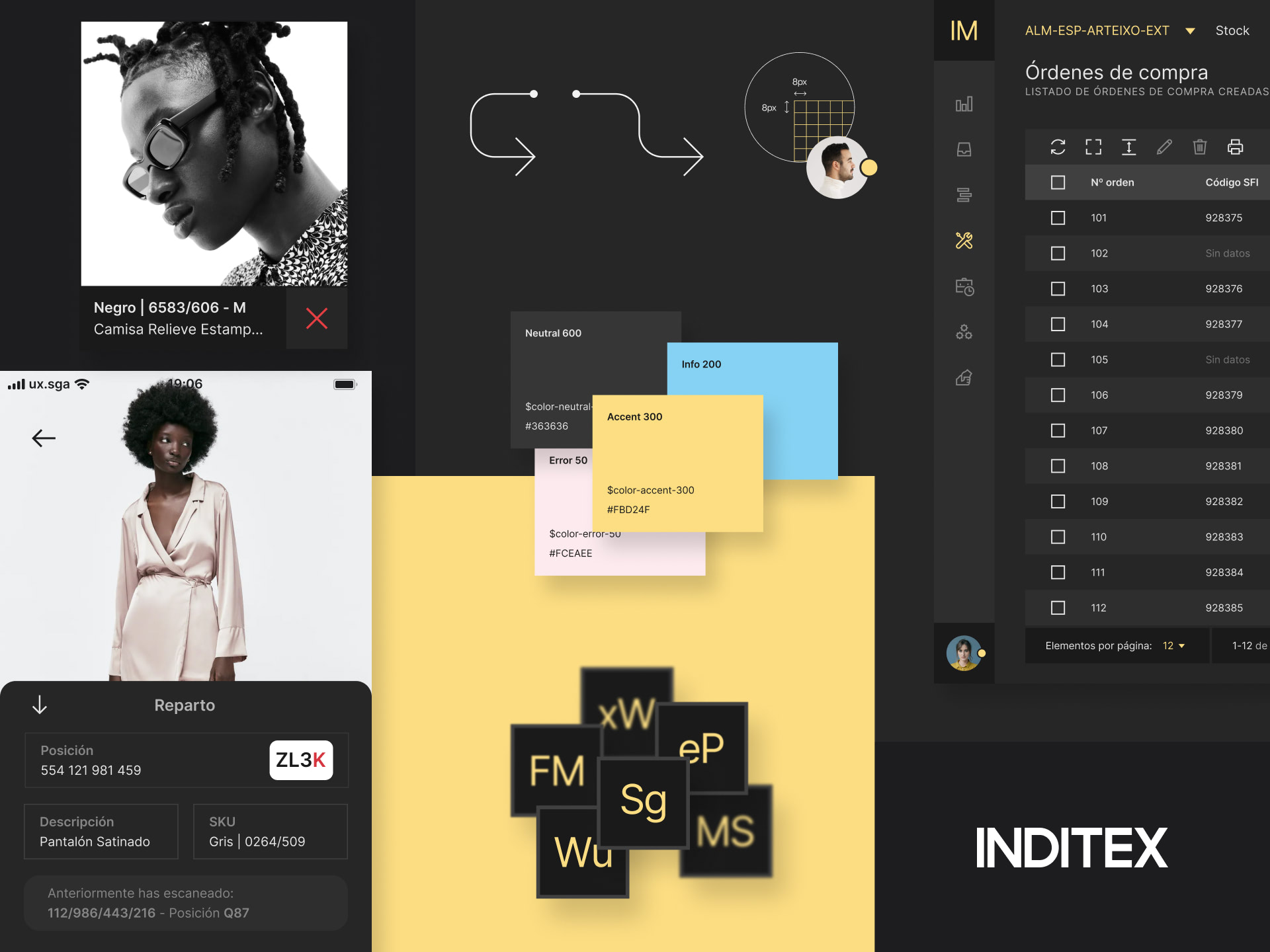
INDITEX NOA FrameworkRevolutionizing digital creation at Inditex warehouses
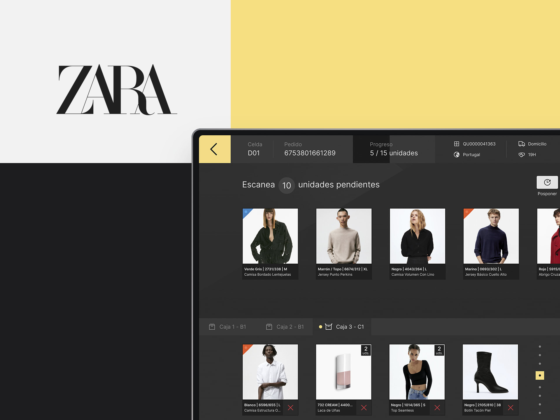
ZARA ePACPackaging with a personal touch
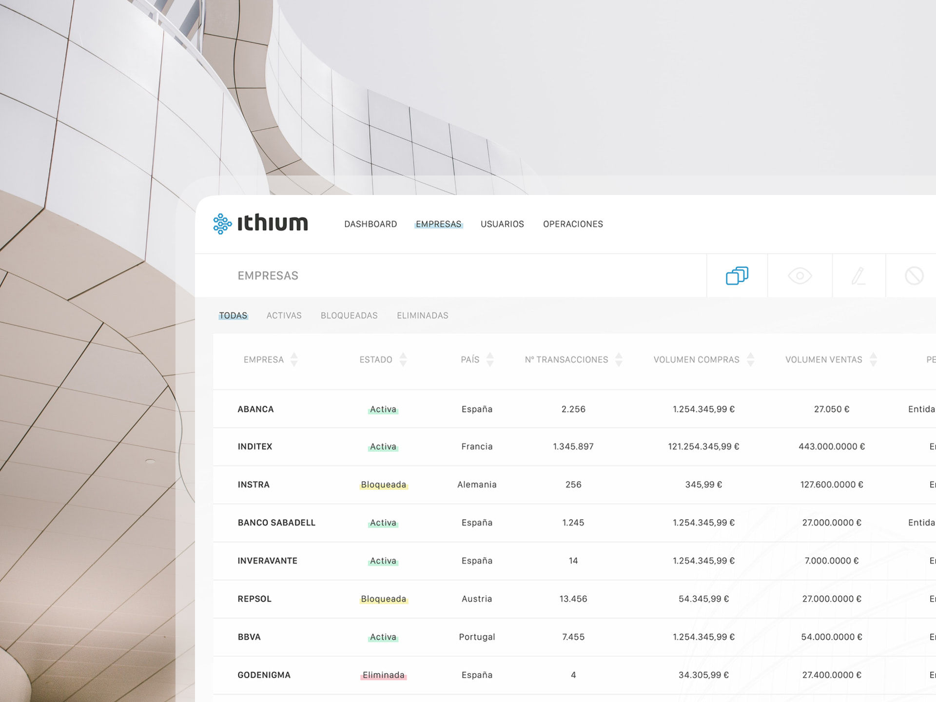
Ithium FinanceUser-centric blockchain empowerment
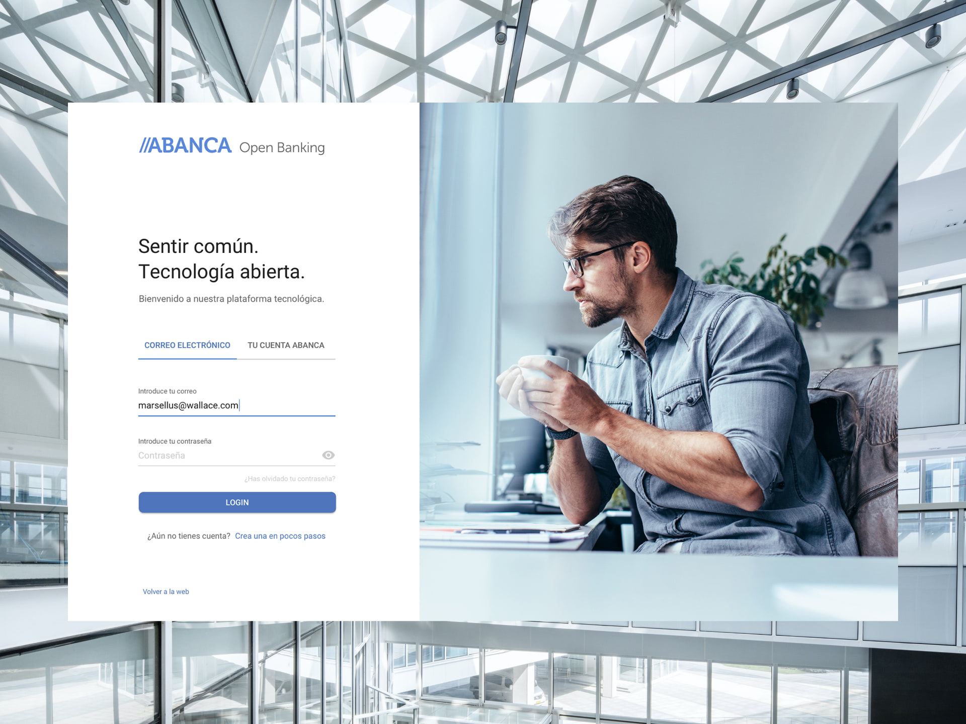
Abanca Open BankingAn open platform for next-gen banking
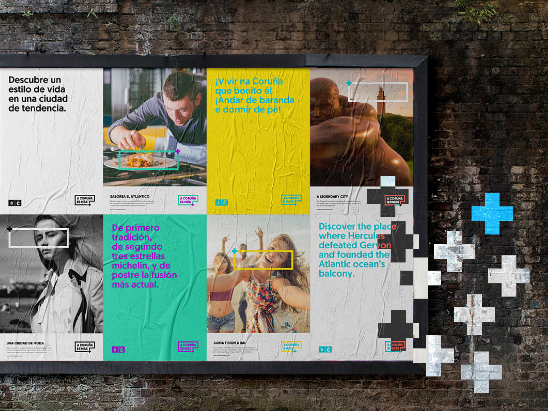
A Coruña es másUnveiling a city's essence

XingfuA digital bridge between cultures

Poster CollectionCreativity meets expression
WebfolioFunctional and impactful websites
LogofolioCurated and distinct identities
